
Like bar and column charts, graphs or line graphs in Excel are useful for providing comparisons of data across one or more data series. In this tutorial, we will discuss how to make a line graph in excel with multiple lines that have a marker for a data series, as is often used by newspapers and magazines to present stock and forex value information.
The difference is that line graphs allow us to spot trends or patterns in data over time. For example, the ups and downs of sales, company profits, temperature, or stock and forex prices during a certain period.
What is a line graph (chart)?
In a line graph in Excel (also called a line chart), we represent data categories on the horizontal axis and data values are on the vertical axis.
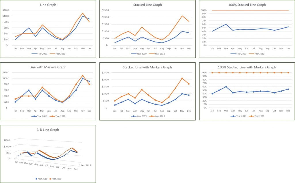
Microsoft Excel has several line graph models, namely: line, stacked line, 100% stacked line, line with markers, stacked line with markers, and 100% stacked line with markers which has a marker and one without a marker in 2-D form, as well as a 3-D model line diagram. 3D Line is like the basic line graph but is represented in a 3D format.
When to use line graphs?
Use a line graph if:
- Has multiple data series.
- Have data at equal or sequential intervals, such as days, months, quarters, or fiscal years.
Steps to make a line graph in Excel with multiple lines:
Line diagrams show the data in such a way that fluctuations and developments can be read off quickly. It’s easy to make a line chart in Excel. Follow these steps:
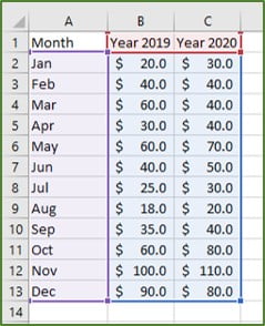
1 Select the data range for which we will make a line graph.
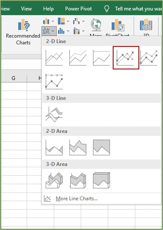
2 On the Insert tab, Charts group, click Line and select Line with Markers.
Quickly Change Diagram Views
A quick way to change the appearance of a graph is to use Chart Styles, Quick Layout, and Change Colors.
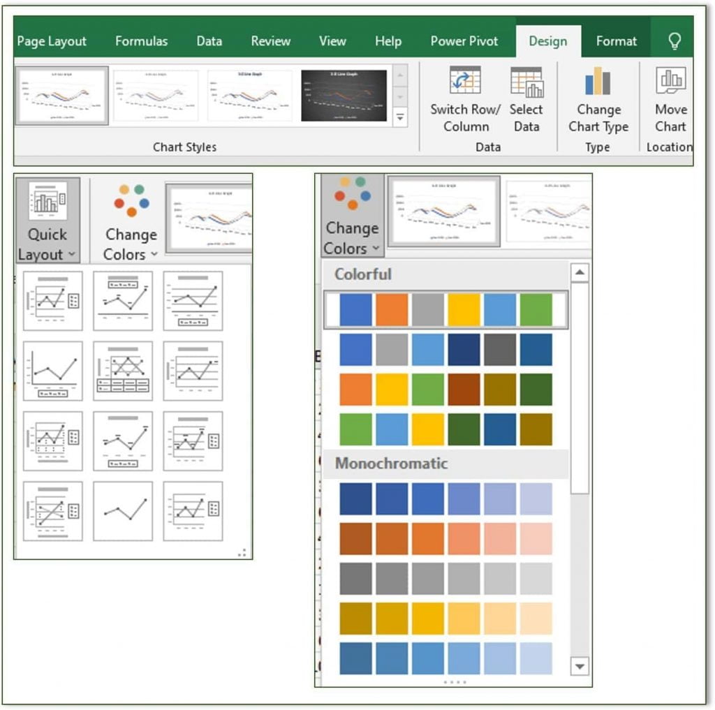
These features are in:
- Excel 2013, 2016, 2019, 365: select in the Design tab.
Tip: Click the brush icon on the top right of the graph to select Chart Styles and Colors. - Excel 2007 & 2010:
- Select Chart Styles and Layout on the Design tab.
- Change the color by changing the Colors on the Page Layout tab.
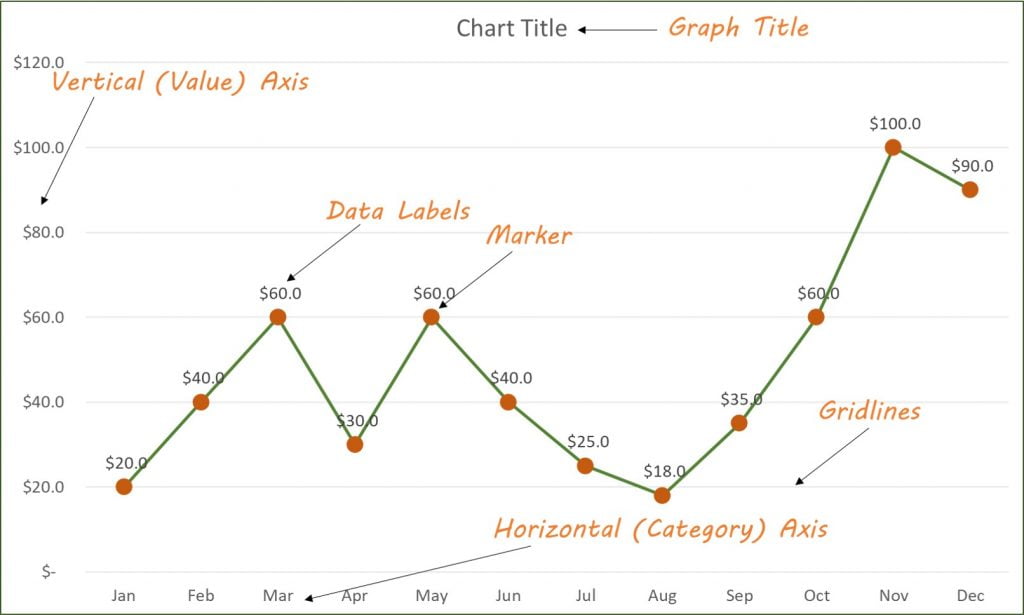
Displaying graph elements (Data Labels, Gridlines, Graph Title)
See the caption on the figure for the elements on the line graph.
We can show or hide and position these elements at:
- Excel 2007 & 2010: set in the Design tab.
- Excel 2013, 2016, 2019, 365:
- Click the + sign at the top right of the graph.
- Check or clear the element box.
- Click the arrow next to the element name to reposition it.
Tips: we can also access this feature on the Design | tab Chart Layout | Add Chart Element.
Chang the Marker Shape and Diagram Line
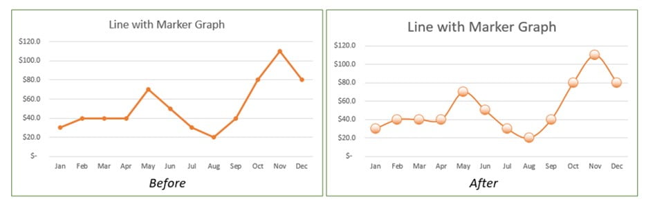
Here we will change the appearance of the marker to a circle and create a line on the diagram that is shaped like a thin rope that swings up and down according to the data values.
To change the Marker option, following process:
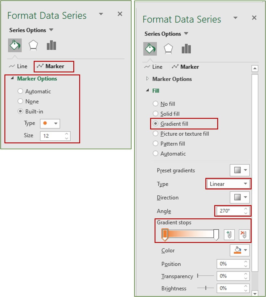
1 Right-click on the line graph or marker and select Format Data Series.
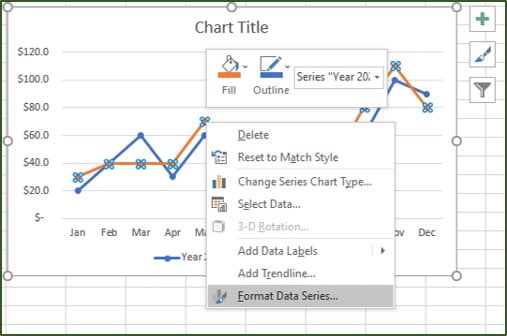
2 Select Fill & Line.
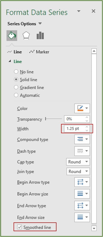
3 Click Line:
- Set the Width to 1.25 pt to make a thin line.
- Check the Smoothed line box to get rid of the appearance of stiff lines.
4 Click Marker and make the following settings:
- Marker Options: click Built-in. In the Type section, select the circle shape and set the Size to 12.
- Fill: Select Gradient fill. In the Type: section select Linear and Angle: 270 °. In the Gradient stops: adjust the position and color.
FAQ: Line graph in Excel
1. What are Excel charts suitable for?
You can choose between different diagrams in Excel. The purpose of a diagram is to make the values you have marked as easy to understand and clear as possible. There are line, column, bar, pie, ring, and Pareto charts, among others.
2. How do I create a line diagram quickly and easily?
Select the area that you want to transform into a line area. Click on “Insert” in the menu bar and select “Recommended diagrams”. Choose from the recommended graphs for “Line Charts.”
3. What are line charts suitable for?
A line chart is well suited for the types of events that describe a continuous variable. Connecting the data points with lines gives the impression that every value on the line can be a possible event.
4. How do I know which diagram is suitable for my evaluation?
Ask yourself whether you want to show development over time, relations, or a relationship of opposites, for example. You should think about what statement you want to make to the target audience of the diagram.
5. How can I combine a column chart with a line chart?
If you have created a column chart, you can select the item “Data”, “Edit data” in the function bar and thus add a second data series. Now you can select the “Line” display under “Type” under the function bar via “Colors and Style”. The two data series are now shown combined as a column and line chart.


[…] Pareto chart is a kind of chart that includes both bars and a line graph, with the bars representing individual values in descending order and the line representing the […]
Very Intersting and helpful for learn excel work
[…] are many types of graphs in Microsoft Excel, such as bar charts, line charts, Pareto charts, histograms, and much more. This time I would like to explain about pie […]
Thanks you for shearing this article. It is very helpfull to create a single or multiple line charts in Excel.
Thanks, Mr. Sumon
Great article! That is the kind of information that should be shared across the web.
Disgrace on Google for not positioning this submit higher!
Come on over and consult with my website . Thanks =)