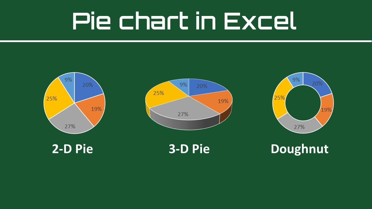
This time, we will introduce how to make an Excel pie chart, its types, add or remove the legend, label your pie chart, show percentages, explode or rotate a chart to sectors, and much more tricks to make it easier to see.
There are many types of graphs in Microsoft Excel, such as bar charts, line charts, Pareto charts, histograms, and much more. This time I would like to explain about pie charts.
What is the pie chart in excel?
A pie chart is a circular graph that displays data. The graph’s parts are proportional to each category’s percentage of the total. On other hand, the size of each slice of the pie is proportional to the total size of the group. The full pie represents 100% of the whole, whereas the pie slices represent sections of the whole.
Pie charts are often used when you want to see the percentage and composition of data. In this article, you will learn how to make an excel pie chart easily.
How to make an Excel pie chart is easy!
To make a pie chart in Excel is extremely easy and takes nothing more than a few clicks. Properly organize the source data in your spreadsheet and select the most appropriate type of pie chart.
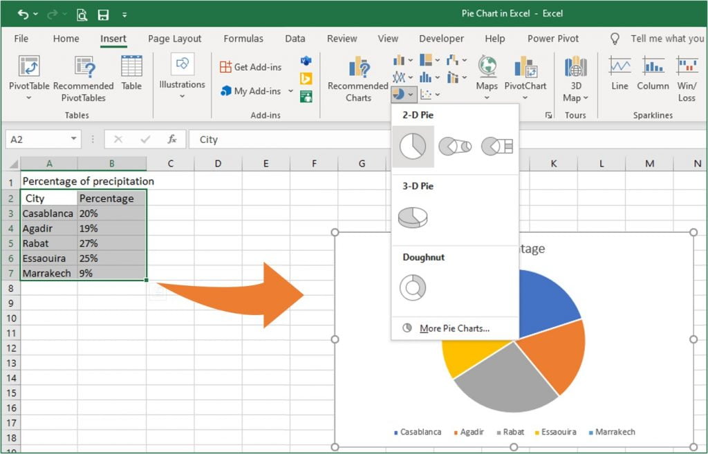
The method for inserting a pie chart is as follows. It’s very easy to just insert.
Procedure
1 Select the data you want to make into a pie chart
2 Go to the “Insert” tab and then select “Pie chart” in the charts groups.
Note
Include column or row headers in the selection if you want the column/row header to automatically appear in the title of your pie chart.
Types of Excel pie charts
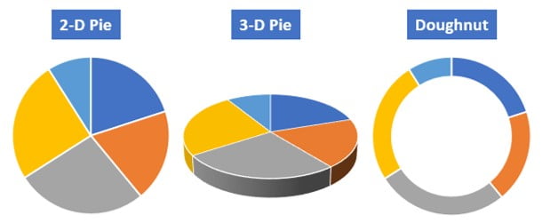
There are three main types of pie charts.
- 2-D circle: Most commonly used pie chart
- 3-D circle: Three-dimensional pie chart
- Doughnut: Circle graph with a hole in the middle
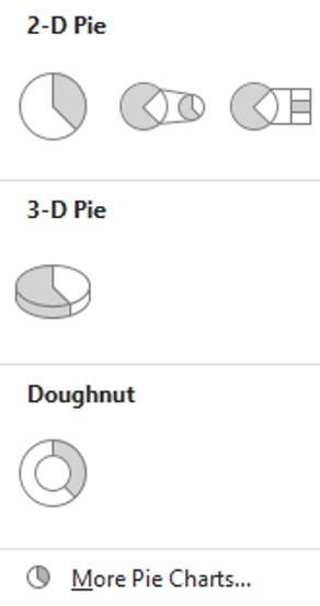
Besides the usual 2-D pie charts, there is a pie of pie chart and bar or pie with a circle. This is a graph used to further subdivide only certain items into the original pie chart and see the breakdown.
The 3-D pie chart is basically not recommended. Since the circle looks distorted because it is three-dimensional, the area and proportion of the graph can’t be read correctly. Unless you have a good reason, it’s best to avoid 3-D pie.
Doughnuts can double graphs and are sometimes used when comparing two data.
Basically, I think there is no problem if you can use 2-D pie charts properly. Subsidiary pie charts, 3-D pie, and doughnut pie charts are a little difficult to handle because they are inevitably complicated.
When should a pie chart be used?
Pie charts can be said to be the most common graphs, but don’t use them easily. Note that depending on the content of the data, making a pie chart may make it difficult to read the data.
Conditions when using a pie chart
1 When you want to express the ratio of data
2 When the difference in the ratio of each item is large,
3 When the number of items to be compared is small,
① is a major premise of a pie chart. A pie chart is a good graph to show the percentage of data, not the absolute value. Therefore, it is used when you want to show the composition ratio (ratio) of data.
② and ③ are also important points. Even when expressing proportions, there are cases where it is better to use a bar graph rather than a circle if there is not much difference in the numerical values of each item. Pie charts are useful when they include overwhelming proportions or extremely low items.
Pie charts are also suitable when the number of items is small (2 or 3 items), such as agree or disagree or yes or no or other.
Customize and improve Excel pie charts
If you leave the pie chart at its default, it’s unclear what you want to convey. With a little processing, the graph will be easy to see and convey. Then, introduce some tricks to refine the pie chart.
Add chart element
You can add, remove, or adjust the position of a chart title, data labels, and legend in two ways. That’s ways become available after selecting the chart.
One of the Add Chart Element is available in the Chart layouts command group under the “Chart Design” tab.
Another is a green plus (+) icon, which is available in the top right corner after selecting the chart.
Quick formatting of data labels in excel charts
The “Chart Design” tab provides a quick layer of customization of data labels, which is available when you select a chart.
1 After selecting a pie chart, select the graph tool “Chart Design” tab
2 Click “Add chart element” from the chart layouts command.
3 Hover the cursor over the “Data Label” option and select one from the list, which you want to be shown.
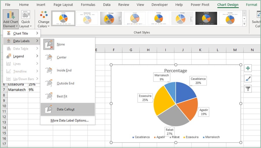
To customize other data label formatting options, after select one of the data labels then right-click on it, and then click “Format Data Labels“.
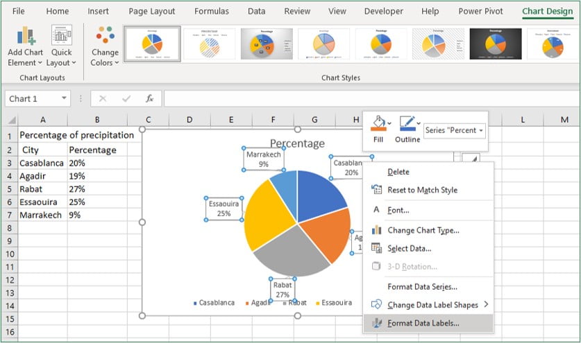
A “Format Data Labels” pane will appear on the right sidebar.
In the Format Data Labels pane, you can see two sets of options – one is Label Options, and another is Text Options.
Label options
The label options allow you to do the following types of formatting:
- Fill & Line: You can fill color to the labels & make a border to the labels.
- Effects: Apply Shadow, Glow, Soft Edges, and 3-D format.
- Size & Properties: Change the data label’s size and alignment.
- Label Options: Using the label options, format the label values.
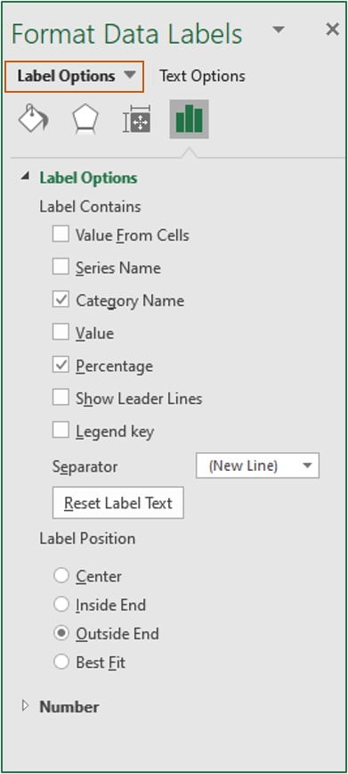
Keep the default data label settings if you want to keep things simple. You might want to alter the color or text size of these labels in some circumstances. However, the default settings are usually sufficient.
Text options
You can change the following settings in the text formatting options:
- Fill and outline text
- Text Effects
- Text zone
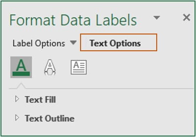
In the vast majority of situations, the default settings are sufficient.
Formatting the Legend
From here, you can also adjust the “Legend” position or you can also format the legend of a pie chart like any other chart in Excel.
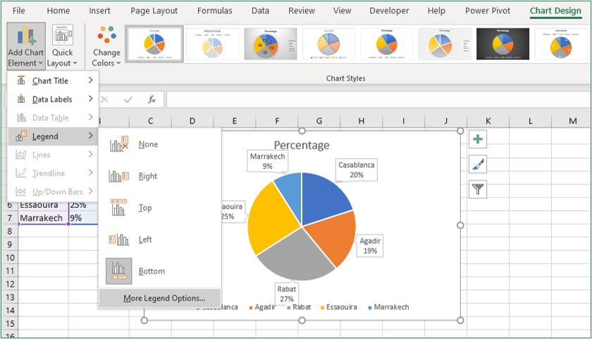
To customize the formatting of the legend, select the chart and click on the “Chart Design” tab.
In the Design tab, click on “Add Chart Element” in the Chart Layout group.
Hover the cursor over the “Legend” option and select anyone or click “More Legend Options“.
You can see the Format Legend pane on the right sidebar.
Here you can see two options: one is Legend Options, and another is Text Options.
- Legend options: Change the fill and line colors, apply effects, and move the caption around with the legend choices, which allows you to place the caption on top, bottom, left, right, or top right.
- Text Options: Change the color and outline of the text, as well as the text effects and the text box, with these settings.
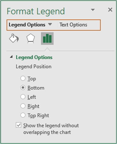
In most cases, none of these options needs to be altered.
Change the color to make the pie chart easier to see
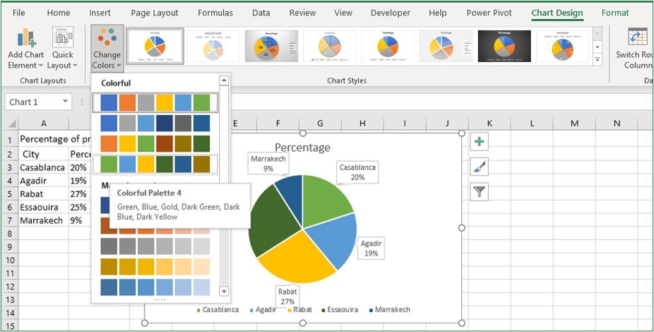
Excel already has pre-defined styles and color combinations you can use to instantly format your pie charts.
To change the color, select the chart and go to the “Chart Design” tab. Select any one color combination from the “Change Colors” command.
Highlight a slice in the pie chart
By default, Excel pie charts are multicolored. So, let’s adjust the color and change it to a pie chart that is easy to see and conveys.
The easiest way is to use “brilliant colors (red or yellow)” only for the items you want to emphasize and gray-scale the others. This makes it clear to the viewer of the graph “where to look”.
Select one slice which you want to highlight.
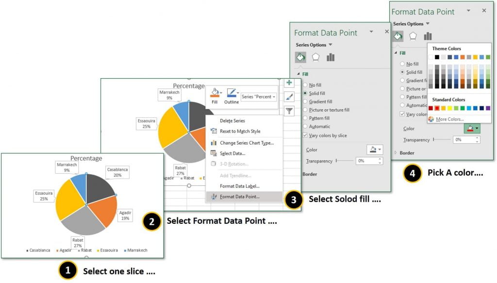
Right-click on it and click the “Format Data Point” from the context menu.
Go to Fill & Line and select solid fill and pick a color.
Note
If you want to show your other slices in one color, then uncheck “Vary colors by slice“.
Separate a slice to highlight
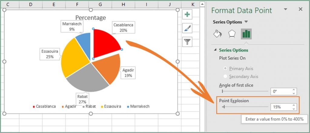
If you have a slice that you want to highlight and analyze, you can use the “Point Explosion” option in the Series Options tab. To separate a slice, simply select it and increase the “Point Explosion” value or dragging by clicking.
FAQ: Pie chart in Excel
How to rotate Excel pie chart
For better readability, it can sometimes be helpful to rotate or rotate the diagram.
To do this, right-click in the pie chart and select ” Format data series “.
A dialog box now opens on the right, where an adjustment is possible under ” Angle of the first segment “.
How to compare two data in a pie chart (double doughnut pie chart)
The last is how to make a double pie chart to use when comparing the composition ratios of two graphs. This is easy because you just need to select two data and insert a donut.
1. Prepare two data
2. Select two data
3. Insert a Doughnut

