
Axis labels are words or numbers that appear along with the horizontal (category, or “X”) axis and the vertical (value, or “Y”) axis of a chart. Category axis labels are taken from the category headings entered in the chart’s dataset. Value axis labels are calculated based on the data shown in the chart. In this guide, you can learn how to change axis labels in Excel (Horizontal “X axis” and Vertical “Y axis”)
Step-by-Step guide: How to Change Axis labels in Excel
Charts typically have two axes that are used to understand the data across measures and categories. These axes are: the vertical axis (Y) and the horizontal axis (X). 3D charts have a third axis, called the depth (series) axis or Z axis, while pie charts have no axis. Since we are going to talk about changing chart axis labels, first we need to create the chart.
To create a chart, select Spreadsheet Data > Insert tab > Chart Group > Column Chart > 2D Column. [In our example]
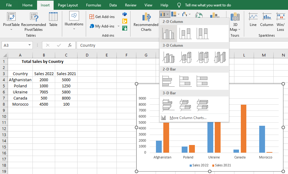
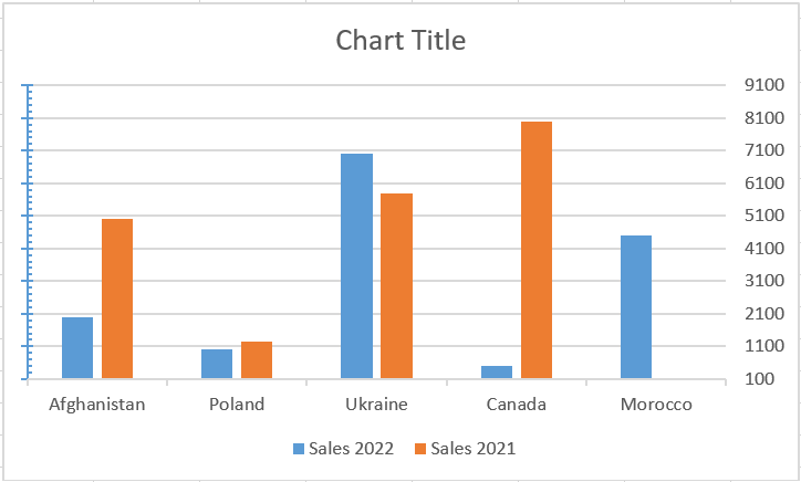
Once the chart has been created, we can see the two axes that come by default: one with the name of the series (in this case the country) and the second that measures from 0 to 9000, with the legend labels below them-Sales 2022 and Sales 2021.
Change the Horizontal X-Axis Labels
Here we are going to explain the 3 easiest methods to change axis labels. Let’s get started.
Method-1: Changing the worksheet Data
- Select the entered data that you want to change the label.
- Type the text in this cell and press Enter.
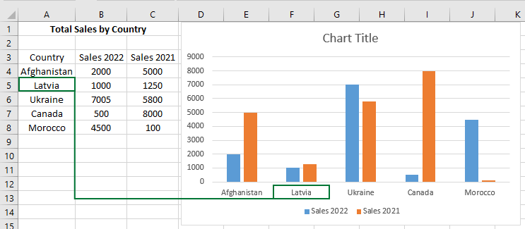
The chart axis labels will update automatically when you change the text in the cells.
Method-2: Without changing the worksheet Data
- Right-click the horizontal axis (X) in the chart you want to change.
- In the context menu that appears, click on Select Data…
- A Select Data Source dialog opens. In the area under the Horizontal (Category) Axis Labels box, click the Edit command button.
- Enter the labels you want to use in the Axis label range box, separated by commas.
- In the Axis label range box, enter arbitrary labels separated by commas.
- Click OK to confirm the chart axis labels change.
Method-3: Using another Data Source
- Repeat steps 1 to 3 of Method 2.
- Select the cells containing the new value range to use the X-axis.
- Then click on the OK to close the Axis Labels dialog box. The Select Data Source dialog box will return and notice that the current values for the X-axis of the chart are replaced with the newly selected values.
- Finally, click the OK button and the values will be replaced with your selection.
Note that:
This process works if you want to change the values of the vertical axis. Just right-click on the Y axis instead of clicking on the X axis.
Change the format Text or Number of the Axis Labels
To change the font formatting like the font, color, style, and size of chart axis labels, select the axis you want to change.
Go to the Home tab on the ribbon, then click the default arrow of the Font group and pick another fort, color, size, etc.
Tips: If you want to quickly format the y-axis to the same font, color, style, and size, follow these steps.
- Select the x-axis.
- Go to the Home tab on the ribbon.
- Click the Format Painter button from the Clipboard group.
- Click on the y-axis.
Both chart axis labels now have the same font, color, style, and size, this technique can be used in other Excel objects, not just charts.
Show or hide Axis Labels
When you click on the chart, a green color “+” sign appears next to it (2013 or later versions). Click this button, all elements will display which is available for that chart. Click on the Axis right arrow button & check or uncheck the axis type you want to show or hide (Primary Horizontal for category x-axis & Primary Vertical for value y-axis).
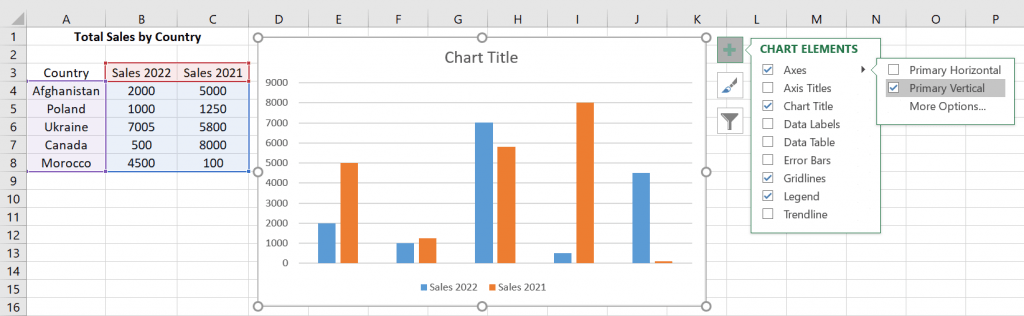
Note that if you want just to hide any axis of the chart, select this and press Delete on the keyboard. To return, press Ctrl+Z or follow the above methods.
Learn how to change the format of the Horizontal Axis
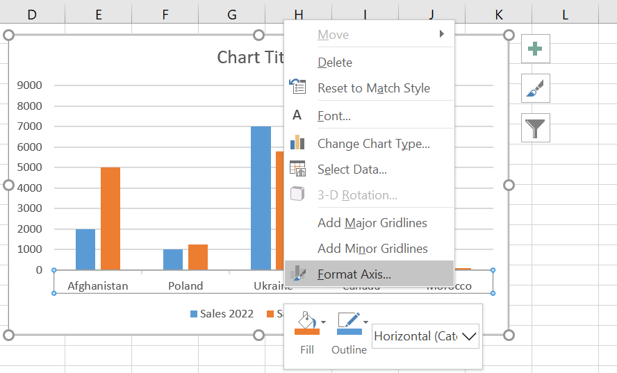
1. Right-click on the horizontal axis and choose the Format Axis option from the context menu.
1. Right-click on the horizontal axis and choose the Format Axis option from the context menu.
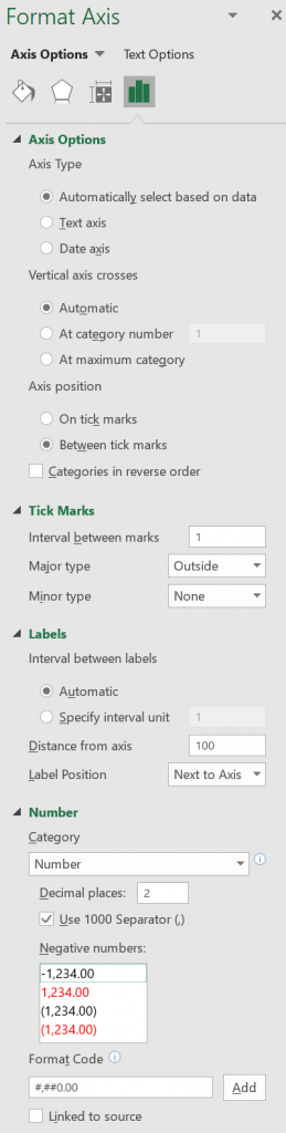
2. The Format Axis window appears with several options to change the axis of the chart.
Axis Options
At this point, you can make several changes:
- You can transform the axis type (text-based or date-based);
- Also, you can change the point where the vertical (value) axis will cross the horizontal (division) axis, and type the number that you want in the “At category number” box. If you want to cross the vertical (value) axis after the last category on the horizontal (category), then select “At maximum category“.
- Check the “Categories in reverse order” box, if you want to reverse the order of categories.
Tick Marks
- Type the number that determines how many categories will appear between the tick marks in the Interval between marks box.
- And select any of the options in the Major type and Minor type boxes to change the axis tick marks position.
Labels
- Type the number (1 to display a label for every category, 2 to display a label for every other category, 3 to display a label for every third category, and so on) in Specify interval unit box under Interval between labels.
- Type any number in the “Distance from axis” box to change the position of the axis labels.
Number
- Under Axis Options, click Number, and select the number format you want in the Category box.
- You can specify the decimal number in the Decimal places box, also you can separate 1000 using (,) and select the negative number format.
- Check the Linked to Source box to remain numbers linked to worksheet cells.
Learn how to change the Chart Vertical Axis in Excel
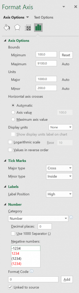
- Right-click on the vertical axis and choose the Format Axis option;
- The Format Axis window appears with several options to change the axis of the chart;
- Choose the maximum and minimum options of the axis;
- You can also choose chart axis Tick Marks, Labels & Number options in Excel.
Let’s try changing the axis of the chart. To do this, right-click on the vertical axis and choose the Format Axis option.
Notice that on the right side of your screen a new window appeared, called Format Axis, with several options to change the axis of the chart.
Change the Minimum and Maximum Values of the Chart Axis
The ruler of our chart goes from 0 to 9000 which Excel automatically chooses. However, we don’t want it to be like that; we want it to start at 100. For that, we simply change the Minimum to 100 and when we press Enter, we will already have the result. If you want to change the Maximum limit, the procedure is the same, but we will not do it at this time.
Change the Chart Axis Tick Mark
Scroll down the scroll bar and expand the Tick Mark option, select any of the available options, and follow the results on the chart. Let, for example, Major Type: Cross and Minor Type: Inside. See that a blue scale appeared on your vertical axis.
Changing Chart Axis Labels
Vertical Axis labels, by default, come from the left side, but we can put them on the right side. For that, we just need to change the Label Position to High or None if we don’t want them to appear.
Changing the Axis Number of the Chart
We can also change the format of the numbers. It is not necessary for this chart, but depending on the situation you can put values in Accounting, percentage, or any other of the available formats.
Result: Changed Vertical (value) axis labels of the Chart

[…] Select all the data you want to include in the Excel graph. Make sure to select column headers if you want them to appear in the chart legend or axis labels. […]