Excel quick analysis is one of the tools that are included as new in the latest versions of the Excel spreadsheet program, especially you can find it from the Excel 2013 version.
Excel Quick Analysis tool allows you to analyze your data quickly and easily using different options.
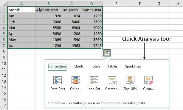
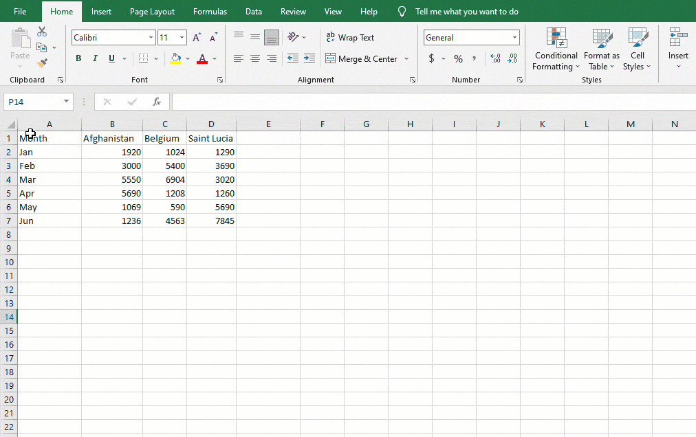
The quick analysis tool icon appears at the bottom right of the selected data. Click on the quick analysis tool button or press “Ctrl+Q“. Quick Analysis Tools appear with the Formatting, Charts, Totals, Tables, and Sparklines options.
Overview of the Excel Quick Analysis Tool
You can see several options under the 5 categories.
If you click on each of the menus that I just mentioned, different options appear for each of them. In fact, as you place the mouse over each option you can see how each of the tools is previewed in the data for the option you have chosen.
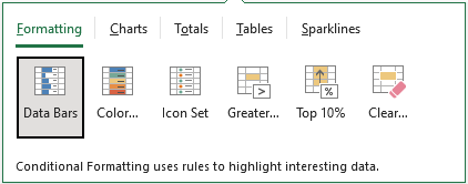
- In Formatting: Closely related to Excel’s Conditional Formatting, you find: Data Bars, Color scales, Icon set, Greater than…, 10% of values greater than, Clear.
- In Charts: Clustered Column, Line, Stacked Column, Stacked Area, Scatter, and More.
- In Totals: Sum, Average, Count,% Of Total, Sum Rows,…
- In Tables: Table, PivotTable.
- In Sparklines: Line, Column, Win/Loss.
Note that the options are somewhat different depending on the data you have previously selected, for example, if there are no numbers in the data, only text, no more options appear in the Chart section.
Where is the Quick Analysis Tool in Excel
There is no listing of the quick analysis tool’s button on the Excel ribbon.
To start a quick analysis, you first have to select a range of cells with data, once done, a small button ![]() appears in the lower right area of the selected area. This small button is known as the quick analysis tool.
appears in the lower right area of the selected area. This small button is known as the quick analysis tool.
Why is the Quick Analysis Tool Excel not showing up
If you cannot see a quick analysis button after you select the data, it may be disabled from the options. To enable the quick analysis tool in Excel, follow the below steps.
Click Options from the File tab.
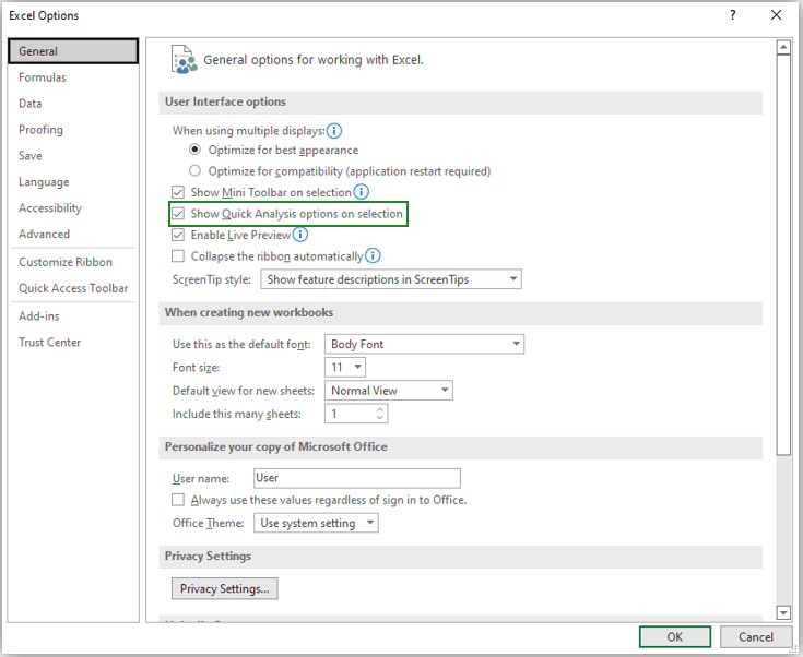
Check the “Show Quick Analysis options on selection” option on the right side of the General tab and then click OK.
How to use the Quick Analysis Tool in Excel
Here are the steps you need to follow to use the quick analysis tool in Excel:
- Enter the data in the appropriate columns and rows.
- Select the cells with the data you want to visualize.
- Click the “Quick Analysis” button
 in the lower right corner of the selected data or press “Ctrl+Q” on your keyboard.
 - Navigate to the type of data visualization method you want.
- Hover over each option to activate a preview of each method.
- Choose the specific format you want to use.
- Click anywhere in the spreadsheet to exit the quick analysis tool.
Why use the Quick Analysis Tool in Excel
The Excel quick analysis tool is easy and fast to use because you can preview the use of different options before selecting the one you want. Some of the options include:
Apply Conditional Formatting with Quick Analysis Tool
Select the data range of the cells and go to the quick analysis menu to apply conditional formatting to your data.
Quick Analysis will display all types of relevant conditional formatting suggestions by placing a cursor on any formatting option under the “Formatting” section. The “Formatting” tab of the Quick Analysis Toolbar has Data Bars, Color scales, Icon set, Greater than…, Top 10%, and Clear buttons.
- Data Bars: fill each cell with a blue color depending on the size of the value.
- Color scales: fill each cell with multiple colors and different shades to best represent the range of values.
- Icon set: represent a green up arrow for the highest value, a yellow left arrow for the middle value, and a red down arrow for the lowest value.
- Greater than: allows you to highlight cells with values that meet the specified criteria. For example, you can fill all cells with values greater than 5000 with green.
- Top 10%: highlight values greater than 10% of the selected data.
- Clear: all conditional formatting you have set.
Create Charts with Quick Analysis Tool in Excel
You can also use quick analysis to create Charts with just one click. The “Charts” tab of the Quick Analysis Toolbar has Clustered Column, Line, Stacked Column, Stacked Area, Scatter, and More buttons.
From here, you can select the required charts that suit your data structure.
To get more chart suggestions, Click on the “More” button.
Calculate Rows or Columns Totals with Quick Analysis Tool
The Totals tab of quick analysis helps you to calculate automatically different totals for specific columns or rows.
Under the “Totals” menu, you can quickly calculate SUM, Average, Count,% Total, Running Total, and Rows SUM.
Click on the right arrow (>) button, you can see the other options to calculate Rows Average, Count,% Total, and Running Total.
Create Tables with Quick Analysis Tool
The Tables tab of quick analysis helps to sort, filter, and summarize your data in Excel. You can create a table or pivot table from your data range using the Tables tab on the Quick Analysis toolbar.
Table and Blank… are the two options available under the Table tab. The blank… option adds the PivotTable. You can see a preview while creating a table from the data, but PivotTable does not provide a preview option.
The table will convert the selected range of cells into table format. Click the Blank… button to create a PivotTable on a new sheet. Pivot tables are useful data analysis tools built into Excel. Drag each field into the Filters, Columns, Rows, and Values boxes to customize your PivotTable.
Create Sparklines with Excel Quick Analysis Tool
Quick Analysis allows you to view sparklines with a single click. A sparkline is a small chart that fits in a single cell and is useful for displaying data from a particular row or column. In the Sparklines tab, you can insert Line, Column, and Win/Loss sparkline charts to the right of the data.
Benefits of Using the Quick Analysis Tool in Excel
Using the Excel Quick Analysis tool offers a convenient alternative to formatting and visualizing data. It can help you work more efficiently by providing an accessible menu of visualization options rather than requiring sorting in the toolbar.
Navigating through the quick analysis tools menu allows you to see what your data visualization might look like, generating a real-time preview of each method. This can help you determine which method you find most effective.